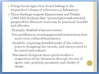
As college students, we're always asked to do presentation. PowerPoint is often used as a tool for most presentation. The main purpose of is create maximum impact in minimal time and persuade the audience to take action, physically or mentally (Schelle, 2010). But how is a good presentation should be?
Regarding my group's last two weeks summary presentation, I will be discuss few points about the layout, content and design. According to Russell's view, a good PowerPoint presentation's layout design should have following aspects:
1. The title should put at the top of the slide where audience can easily find it. Captions should be put appropriately to meet audience expectations.
Singer (2002) says that slides are easier to read using unjustified (ragged) margins.
2. Limit the number of slides to make sure the presentation should not be long.
My group presentation, we had 13 slides which is average for 5 members to present the content, but not wasting time. Besides, one slide should be present within one minutes.
3. Every slides should not more than four points which will make the slide too long. Choose only the top three or four points related to the topic and make them consistently throughout the delivery. Ever slides should simplify and limit the number of words and surrounding space will make it easier to read.
4. Avoid spelling grammar error. Spelling and grammar should be check before presenting the slides. Because there are similar words that might confuse audiences.
A good presentation should have an analysis of its argument and theory in a form utilizing empirical evidence and logical reasoning to better understand some phenomena. A good presentation also should remain unchanged and conveyed without information loss, regardless of its audience. Putnis and Petelin (1996) also state that negative space (white) and positive space (text, title, visuals) should be balanced.
1. Kreiger, S 2010, 12 tips for creating better presentations, viewed on 1/9/2010, retrieved from http://www.microsoft.com/atwork/skills/presentations.aspx
2. Putnis, P and Petelin, R 1996, 'Writing to communicate', Professional communication: principles and applications, Prentice Hall, Sydney, pp.223-263.
3. Rothman, S 2005, What Makes Good Scientific and Technical Writing, viewed 1/9/2010, <http://www.associatedcontent.com/article/9447/error?cat=4>
4. Russell, W , 10 Tips For Creating Successful Business Presentations, viewed 1/9/2010, <http://presentationsoft.about.com/od/powerpointinbusiness/tp/bus_pres_tips.htm>
5. Schelle, T 2009, The purpose of a powerpoint presentation, viewed on 1/9/2010, retrieved from

